Position은 HTML 요소를 원하는 위치에 배치하기 위한 CSS 속성입니다.
top, bottom, left, right 속성과 함께 사용하여 정확한 위치를 지정할 수 있습니다.
1. 부모-자식 관계 설정
기본 원칙
부모 요소: position: relative
자식 요소: position: absolute

→ 자식 요소는 부모를 기준으로 배치됨
CSS
.parent {
    position: relative;  /* 기준점 설정 */
    width: 600px;
    height: 300px;
    background-color: dodgerblue;
}

.child {
    position: absolute;  /* 부모 기준 절대 위치 */
    width: 200px;
    height: 100px;
    right: 0;    /* 부모의 우측에 붙음 */
    bottom: 0;   /* 부모의 하단에 붙음 */
    background-color: crimson;
}


HTML
    <div class="parent">
        <div class="child">
        </div>
    </div>

핵심 포인트:
- position을 선언해야 top, bottom, left, right 속성 사용 가능
- 부모의 relative가 없으면 자식은 브라우저 전체를 기준으로 배치됨
2. 원하는 위치에 정렬
4가지 기본 정렬
CSS
.container{
	position: relative;
	width: 500px;
	height: 500px;
	border: 1px solid #000;
}

/* 좌측 상단 */
.box1{
	position: absolute;
	background-color: dodgerblue;
	width: 100px;
	height: 100px;
}

/* 우측 상단 */
.box2{
	position: absolute;
	background-color: gold;
	width: 100px;
	height: 100px;
	right: 0;
}

/* 좌측 하단 */
.box3{
	position: absolute;
	background-color: #cc4f4f;
	width: 100px;
	height: 100px;
	bottom: 0;
}

/* 우측 하단 */
.box4{
	position: absolute;
	background-color: purple;
	width: 100px;
	height: 100px;
	right: 0;
	bottom: 0;
}

HTML
    <div class="container">
        <div class="box1"></div>
        <div class="box2"></div>
        <div class="box3"></div>
        <div class="box4"></div>
    </div>
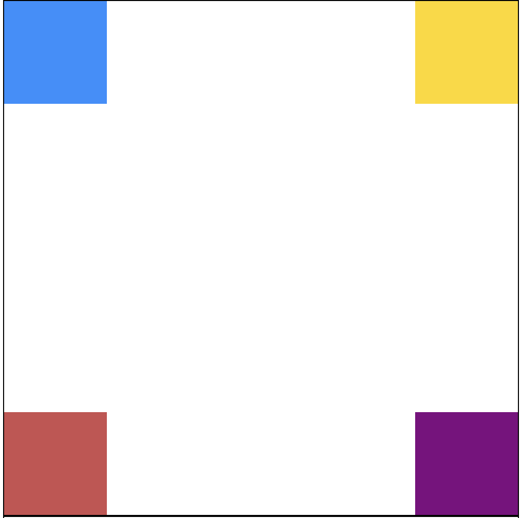
3. 중앙 정렬 (완벽한 중앙)
CSS
.center-container{
	position: relative;
	width: 500px;
	height: 500px;
	border: 1px solid #000;
}

.box-center{
	background-color: dodgerblue;
	width: 100px;
	height: 100px;
	position: absolute;

	/* 1단계: 좌측 상단을 중앙으로 */
	left: 50%;
	top: 50%;

	/* 2단계: 자신의 크기만큼 역방향 이동 */
	transform: translate(-50%, -50%);
}

HTML
    <div class="center-container">
        <div class="box-center"></div>
    </div>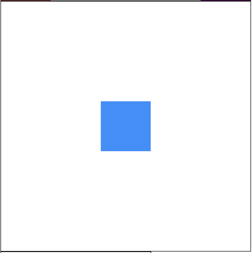
핵심 포인트:
- left: 50%, top: 50%: 요소의 좌측 상단을 중앙에 배치
- transform: translate(-50%, -50%): 요소를 자신의 크기 절반만큼 역방향 이동
- 브라우저 크기와 관계없이 항상 중앙 유지
4. 부모 요소 밖으로 배치
위치 계산 방식
핵심: %는 부모(relative)의 크기를 기준으로 계산

부모 크기: 300px × 200px
top: 100% → 200px 아래
left: 100% → 300px 오른쪽
4가지 밖으로 배치
CSS
/* 하단 중앙 밖 */
.box-out1{
	background-color: dodgerblue;
	width: 100px;
	height: 100px;
	position: absolute;
	top: 100%;
	left: 50%;
	transform: translate(-50%, 0%);
}

/* 우측 하단 밖 */
.box-out2{
	background-color: gold;
	width: 100px;
	height: 100px;
	position: absolute;
	top: 100%;
	left: 100%;
	transform: translate(-100%, 0%);
}

/* 우측 상단 밖 */
.box-out3{
	background-color: purple;
	width: 100px;
	height: 100px;
	position: absolute;
	left: 100%;
}

HTML
    <div class="out-container">
        <div class="box-out1"></div>
        <div class="box-out2"></div>
        <div class="box-out3"></div>
    </div>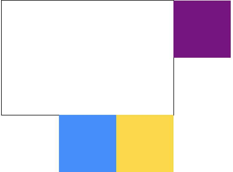
주의사항
자식 요소의 크기는 자동으로 고려되지 않습니다!
/* 잘못된 예 */
.box-out {
    top: 100%;
    left: 50%;
    /* transform 없음 → 박스가 중앙에서 벗어남 */
}

/* 올바른 예 */
.box-out {
    top: 100%;
    left: 50%;
    transform: translate(-50%, 0);  /* 필수! */
}
Transform의 매개변수 translate(X, Y)
transform: translate(-50%, -50%);
                     ↑      ↑
                   좌우    상하
값의 의미:
- 양수(+): 오른쪽, 아래로 이동
- 음수(-): 왼쪽, 위로 이동
- %: 자신의 크기 기준
예시:
transform: translate(-50%, 0);    /* 왼쪽으로 절반, 상하 이동 없음 */
transform: translate(0, -100%);   /* 좌우 이동 없음, 위로 전체 */
transform: translate(-100%, -100%); /* 왼쪽 위로 완전히 이동 */
실전 활용 예시
1. 모달 창 중앙 배치
.modal {
    position: fixed;     /* 화면 기준 고정 */
    left: 50%;
    top: 50%;
    transform: translate(-50%, -50%);
    z-index: 1000;
}
2. 툴팁 하단 중앙 표시
.tooltip-container {
    position: relative;
}

.tooltip {
    position: absolute;
    top: 100%;
    left: 50%;
    transform: translate(-50%, 5px);  /* 5px 간격 */
}
3. 배지 우측 상단 배치
.avatar {
    position: relative;
}

.badge {
    position: absolute;
    top: 0;
    right: 0;
    transform: translate(50%, -50%);  /* 반만 삐져나오게 */
}
핵심 정리
| 속성 | 역할 | 기준점 |
| relative | 기준점 역할 | 원래 위치 |
| absolute | 절대 위치 지정 | 부모 relative |
| fixed | 화면 고정 | 브라우저 화면 |
% 계산 기준
- top, bottom, left, right의 % → 부모(relative) 크기 기준
- transform: translate()의 % → 자신의 크기 기준
Transform이 필요한 이유
position만으로는 요소의 좌측 상단 모서리만 제어 가능 → transform으로 요소 자체를 이동시켜 정확한 위치 조정